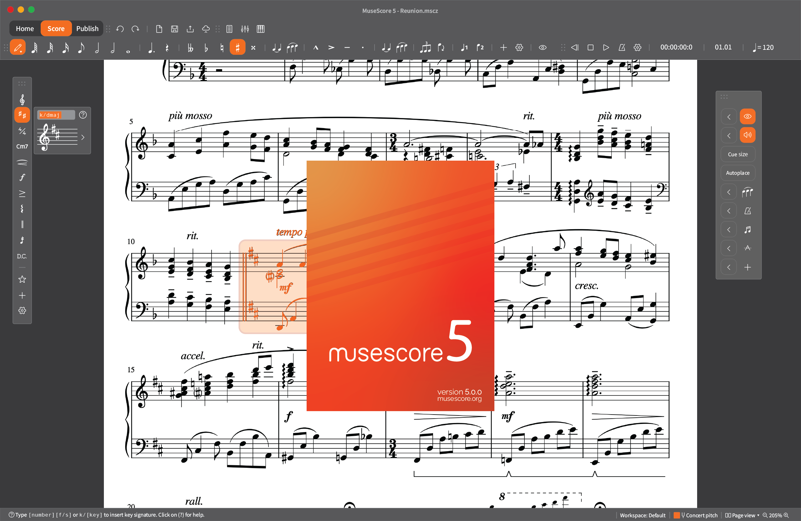
[Repost] A user interface concept I came up with for MS5... and a potential way to simplify the workflow?
(Seems like this is the right forum to post this sort of stuff in, judging from a similar previous post https://musescore.org/en/node/284009).
I've been trying my hands at designing some alternate user interface for MuseScore and here is what I came up with.
SPLASH SCREEN

INTERFACE

The only thing that's probably going to need some explanation is the key signature thing to the left. I took some inspiration from a Dorico feature called "Popovers". Instead of searching through a long list of elements to apply to the score, you could type in a short command and hit enter. In this case, a key signature of D major is generated by either typing "2s" (2 sharps) or "k/dmaj" (key / D major). This could potentially be applied very widely. For example, say you have a passage on the score and want to make it crescendo from a fortepiano to forte, you can select the said passage, type "/" to activate commands, and then follow up with "d/fp < d/f". (Dynamics / Fortepiano, Crescendo, Dynamics / Forte). A three-step process becomes a one-step process.
Otherwise everything is pretty straightforward. I minimized a lot of the text elements into icons and tried to keep the workspace as clean as possible - minimal interruption and maximum music.
| Attachment | Size |
|---|---|
| MS5conceptuiv2.png | 503.18 KB |
| MS5splashfinal.png | 93.85 KB |