GSoC 2018 - Beginner Mode and Tutorial Creation - Week 5
This is my weekly update on my Google Summer of Code project. There will be three parts of this blog post: what I did, what had issues, and what is next. Next, I will have a small showcase of the workspace. Then, I will end it with a question that I need answered for part of the project.
What I did
-
Fixed Translations
- Since Basic and Advanced are no longer built in, they are no longer translated. I fixed that by specifically translating any premade workspace.
-
Fixed many bugs
- This is pretty self explanatory.
-
Worked on building a showcase for this blog post
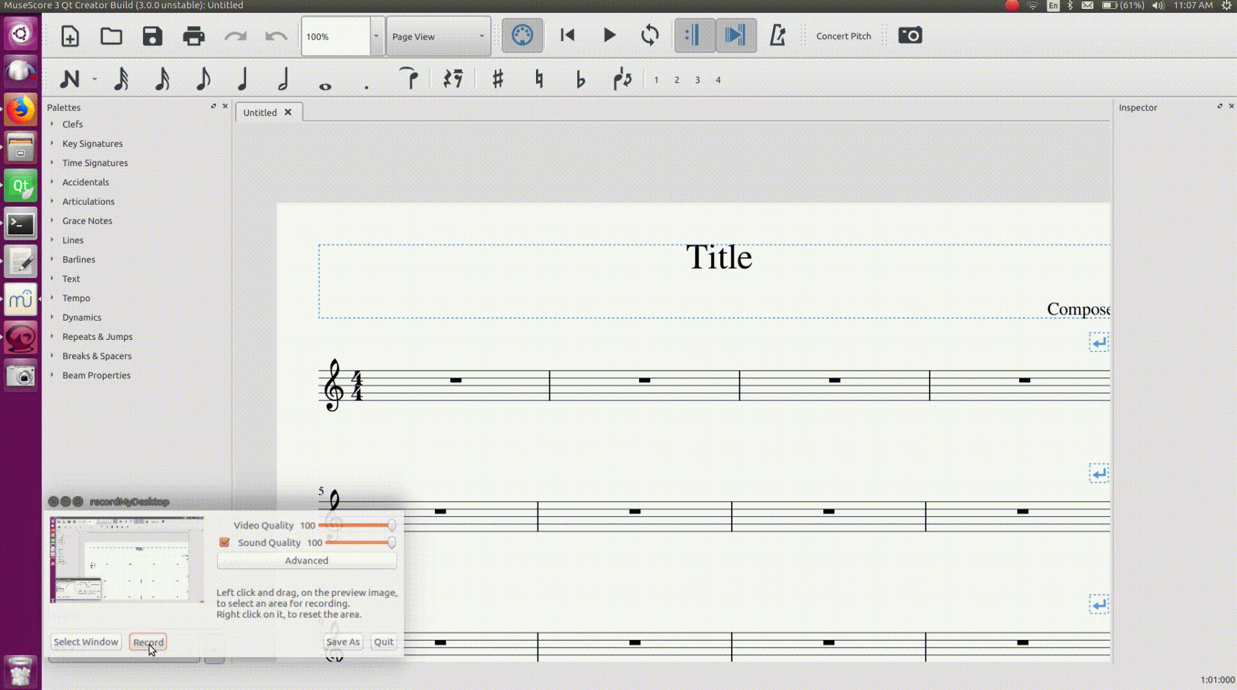
- I built a short gif and screen captures to display the current progress on the workspace.
What had issues
Nothing particularly had an issue.
What is next
- Getting a PR started
- Pretty explanatory.
Showcase
Next, I will show the a short video of changing the workspace. The first workspace is the Basic workspace. The second is a workspace I created with a reduced menubar, a custom GUI setup, different score colors, and customized font. Apologies if the quality is low.

Here is an example of the new workspace dialog. You can create a name and select any of the four components to add to the workspace.

Finally, here is the edited preferences that display the font selection.

Question for the Week
- Since the last blog comments decided that the tour was the next best thing to work on, I need to build functionality to create a tour of MuseScore. So, what functionality for creating a tour would you like to see?
Thanks,
Joshua Bonn
GitHub: https://github.com/JoshuaBonn1
Current Branch: workspace-expansion-3
Comments
Excellent work! Screenshots look great and all is working well from what I've been able to tell in my builds. I haven't looked closely at the code itself except in a few spots where we were encountering problems, but the code I did see seemed good in terms of basic structure and style. I'll review more when there is a PR.
As for the tour, my recommendation is to start by surveying what other apps do. The startup tour is maybe more common for mobile than desktop apps, but either way, it seems there are some reasonably well established conventions to model.
My gut sense is that the first startup (or after factory reset) should start a tour in something like a slideshow format, a series of screen overlaid on top of the main UI highlighting particular features. Maybe two separate parts to it - one part just touring the UI itself, one part actually walking through creation of a score (perhaps replacing the "Getting Started" score).
Ideally I would like to see a true "tutorial mode" where can actually interact with the tour and try out the features being demonstrated, but that can wait for another GSoC :-)