GSoC 2021 - Week-6: Improving Accessibility For the Visually Impaired
Progress at Last!
Greetings!
I hope everyone is staying safe and doing well.
I am getting closer and closer to finishing the project assigned to me, and this week marks the (almost) completion of the new design for the accessibility features.
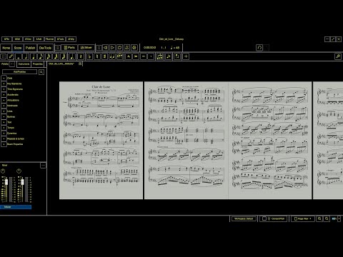
I have embed a short YouTube video in which I use the High-Contrast themes along with other buttons and features that have been changed/added.
I have also managed to find a workaround to the "Changes not showing up" problem that i was experiencing last week. Just going to Help->Reset to Factory Settings forces a reset and a fresh load of default values.
Changes Made/Features Added:
-
Implemented the new design properly. Clicking on the "Enable High-Contrast Checkbox" will now switch you to whichever theme you used last in each category. This setting is stored across sessions, so if a user had Dark Theme and High-Contrast Black Theme modified according to their needs, They will be defaulted to that theme whenever they check/uncheck the checkbox. (These preferences can be reset by going to
Help->Reset to Factory Settings. -
The Score Page Background now defaults to
"#385f94"and"#000000"for General and HC themes respectively, while also being individually configurable. Switching between themes also immediately changes and loads the new background color, as is expected. This setting can be reset to their default values by clicking on the "Reset Theme to Default" button on the bottom of the "Appearance" page. -
I have also changed the default border width of all elements (MS3 ported and MS4 qml) to 1px. I think it looks nicer this way (The setting was at 2px before, and things looked a little chunky).
-
I have added borders to other MS4 elements that i had missed earlier (TabButtons, GradientTabButtons, etc.). The UI looks very nice once you get used to seeing everything with borders.
I have also added borders to the MS3 ported elements too (CheckBoxes, SpinBoxes, new colored ScrollBar for better visibility). These elements have hovered/pressed[/checked] animations to them for some added visual finesse. -
In the Styles Dialog, while hovering over the ListView elements, there is now a border that appears that helps you identify which element is under your cursor. (Of Course, this behavior only gets activated when HC-mode is active). This was needed because the existing animations modify the opacity of
backgroundColor, which is redundant in this case since modifying opacities of"#000000"didn't make any difference. -
Continuing with the border upgrades, the borders for the newly added elements are active or drawn only when they are enabled or in-use. If there is a parent setting that needs to be toggled, the borders for its child settings will only be drawn once it is toggled/enabled.
This works well for all elements, with the exception of the "reset setting to default" button which can be found in front of all SpinBoxes. The current behavior is that we have to toggle them on/off once for them to actually register as enabled/disabled. This will eventually get fixed.
Unfinished/Upcoming Features:
Unfinished:
- The Header/Footer page within the Styles Dialog isn't properly visible. I think it uses
backgroundPrimaryColorandbackgroundSecondaryColor, both of which are set to#000000and#FFFFFFfor HC_Black and HC_White themes respectively.
Upcoming:
- Score Page Color Inversion.
That's pretty much it for this week. Please be sure to share your thoughts, ideas and criticisms in the comment section below.
While you're at it, please also be sure to check out the blog posts of my peers, and remember, kind words and constructive feedback keeps us going :)
You can keep up with my progress at the following locations:
- Weekly blog right here at Musescore.org
- Via the actual code and pull requests from My Fork on GitHub

Comments
Nice work. Looks amazing. :)