Tabbed navigation for styles (and style-like) pages
At present, we have a number of separate dialogues that control aspects of appearance, including general styles, text styles, and page settings. A current (wonderful) new effort is attempting to rationalize the menu navigation for reaching these and other pages (https://musescore.org/en/user/101731/blog/2016/07/01/developing-musesco…).
However, even after this effort is complete, we are still left with a number of distinct but related property pages that, to me, seem closely related enough that they should inter-navigate. I am often puzzled about where to find a particular feature, and wind up bopping back and forth among pages. The logical interface seems, to me, to be a tabbed dialogue structure, as found on the Preferences page.
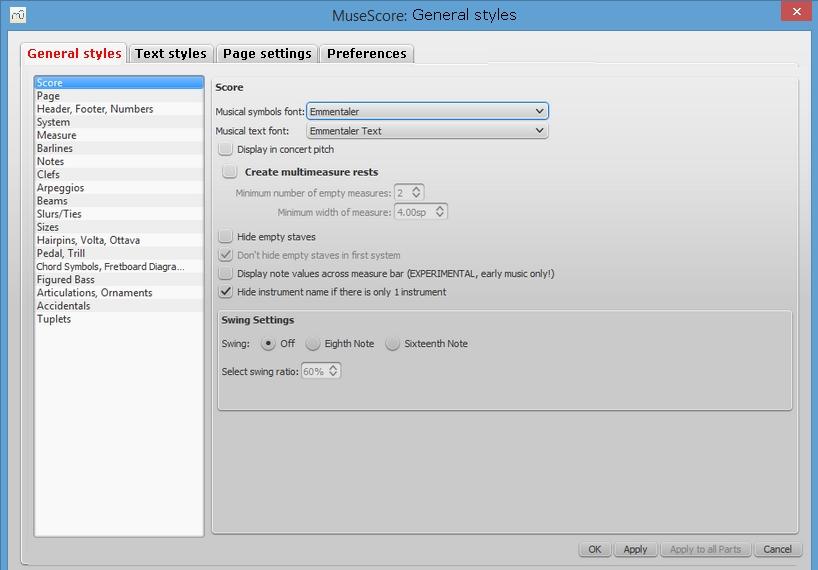
Here is what I envision for the style page. It is probably desirable to retain the various proposed menu entries that go directly to the tabs of interest. However putting them on a single tabbed page would reduce the "where the heck do I find this?" problem

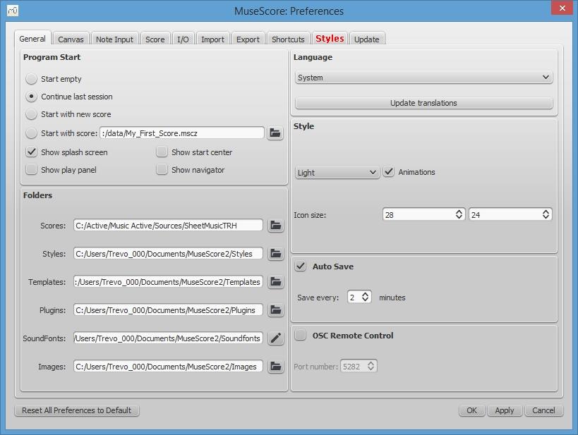
Here is what I envision for the preferences page (note new tab).

I realize these could all be in a single tabbed structure, but the Preferences tabset is already pretty beefy, and this will no doubt continue to expand in future. So I suggest two tabsets, one for stylish things, and one for preferential things, linked together as shown.
Comments?
Comments
I don't like it.
"Preferences" are meant to be MuseScore wide settings. The way you input notes in the whole program, the way shortcuts are configured etc...
Styles (Text + Global) are meant to be score wide settings: The way the current
Every single piece of desktop software I can think of works like this. The "Preferences" dialog is even a guideline on Mac and can be found under the Application menu for every software.
Idem for "page settings". If we exclude "scale" which could move to style, a page settings dialog to deal with paper size and margins is virtually in every software which deal with pages.
The only thing that I don't dislike is the merging of Text and General styles, but I'm not sure how it would make it easier to find something. If this is really a problem then we could 1/ reduce the number of styles/settings (not sure we want that) 2/ make it easier to search/filter them.
In reply to I don't like by [DELETED] 5
These are valid observations. I should have started with my overarching goal of reducing or eliminating modal dialogues and menu clicks -- navigating among modal dialogues via menu clicks is a bit dated, especially when I'm working on my tablet with no mouse or keyboard. Having to click 'Style' and then 'General' seems silly. I just want to click 'Style' and get to the dialogue.
This is why tabbed dialogues and other open-world navigation techniques are appealing to me. Obviously, it would be unwieldy if we put every setting on one massive tabbed structure; but to the extent I can hop easily among settings of interest via direct clicks, rather than up and down through menu navigation, I'm happier.
At any rate, I was focusing on where I wound up looking, instead of why, and on what new users will expect to find on the various pages -- and also on the likely future creep of new style-related features among these pages.
You may know that 'Page Settings' is (or should be) strictly related to physical page layout -- but users from other apps may reasonably look there for the things they would actually find under Style.Page. So if we trim the Page Settings dialogue to be essentially a printer control interface, then I'd be happier with it (and it might eventually get some other useful output-control settings). I'd like this dialogue even more if we retitled it 'Page Layout' or 'Paper Layout' or 'Printer Setup,' since 'Page Settings' has a much broader scope in some desktop apps.
Another thing that keeps me navigating to 'Preferences' is to refer to keyboard shortcuts related to style/layout features. I agree that those shortcuts don't belong in the Style area -- but navigating to them is time-consuming.
At any rate, I have no problem leaving 'Preferences' and 'Page Settings' out of any proposed combined tabbed navigation -- the goal of including them was just to provide faster access paths between today's modal dialogues. But we do need to be sure there is NO reason to visit them (nor for new users to think of visiting them) for the things we do on the Style pages...both now and in the future.
Regarding the merging of Text and General styles: It's not so much how to find something -- there is a very natural distinction between text and non-text objects. ('Sort styles by name' might be helpful.) Rather, I want to be able to reach settings faster than via today's menu plus modal dialogue access.
Another approach would be to have more direct style control via the Inspector. If I could jump directly from a property in the Inspector to its associated style setting, that would cut down on menu navigation. I'd be even happier if I could make my style changes directly in the Inspector, either globally or for this instance, as found in some other apps.
I guess my bottom line is this: I'd like to be able to double-click any object, and have the ability to edit its individual or style-wide properties, without needing menu navigation. To the extent that I must navigate menus to modal dialogues, I'd like easier access among those dialogues. We don't need to force users into preferred modes of operating, nor force them to memorize the location of features of interest. We want to make it easy to guess where to look, and easy to get from place to place.
In reply to These are valid observations. by spinality
Looks like our thinking overlaps again.
One of the goals going forward is to streamline the Properties-Inspector-Styles relationship: instead of having to right-click things to access their Properties dialogs, make everything available in the Inspector; and add a one-click option for most Inspector settings to change the style to match. What about adding a "Style..." button to the top of the Inspector that would go to the relevant section of the Text Styles or General Style dialog, depending on the element selected?
In reply to Looks like our thinking by Isaac Weiss
Yes, great, exactly the kind of thing I had in mind.
I still have the visceral sense that relying on a single-purpose modal dialogue is wasting an opportunity.
By analogy, think about old-style document editors, with their pop-up dialogues for selecting fonts, colors, borders, etc., versus tool-oriented apps like those from Adobe, with toolbars and palettes that are constantly available. This is precisely why we use palettes. I guess I would rather see a "palette-ization" of style and other elements, where practical, so that these features can be manifest to the user, not hidden behind a series of menu clicks that might be overlooked. My tabbed dialogue suggestion was a stumble in that direction, one that I thought would be easier to implement than a wholesale refactoring of interface elements.
In fact these comments grew out of an earlier lament that it was hard to find the "split lines every N measures" functionality, which was buried within the Tools submenu. True, we can improve the menu structure, but the underlying design approach seems out of date.
In reply to Yes, great, exactly the kind by spinality
Finally, a divergence! ;-) I think. Are you saying that you would prefer a single-window interface without menus?
In reply to Finally, a divergence! ;-) I by Isaac Weiss
Well, no. I use menus all the time. And I hate the new OS paradigms that try to make me think I'm using a smartphone. (A dumb smartphone at that.) However I don't like the dependence on modal contexts that often comes with menus, and of course (like you) I don't like poorly structured menus.
Moreover, when I'm using a tablet without a mouse or a keyboard, which with MS is basically all the time, menus become particularly inconvenient. Then I do avoid using them.
So I want the ability to get directly to the functions I use a lot, or that I'm using over and over in some repetitive operation, without a menu navigation interface mediating between me and the tools I'm trying to access.
Again, picture using MS without the palette interface, having to click on a note, grab a menu, pick 'noteheads' or 'duration' or 'pitch' or something, bring up a dialogue, pick the thing, hit "OK", yadda yadda yadda.
In reply to Well, no. I use menus all the by spinality
You probably have no idea that you just described Finale in that last sentence. I'm not kidding.
I don't think modal dialogs are going away any time soon, whether it be to adjust formatting or to choose print options. But if a button in the Inspector as an alternative to the menu makes them easier to access, I think that's reasonable.
In reply to You probably have no idea by Isaac Weiss
Ha ha, it's been a while since I did anything with Finale.
No, I wouldn't expect modal dialogues to go away, but it's something to bear in mind. There are lots of situations where one's instinct may be to have modal control, but by thinking things out it's often possible to allow focus to leave the context and return without breaking things. The Inspector is one of the great elements of MS, and anything to extend its reach and power is a good thing, to my mind. I don't see why any properties of any object should be invisible to the Inspector. And its scope can extend beyond individual glyphs. If we click on the corners of the canvas, for example, we could see margin settings, page properties, etc. Why not? Basically everything should be clickable, to reveal its Inspector properties, and double-clickable, to do whatever is the most logical set of editing actions. If a click or double-click causes nothing to happen, e.g. when in Note Entry mode, then ideally we should figure out what logically should be expected to happen and do that.
Definitely don't merge with Preferences!!
But for the other three (or two, if Page Settings remains separate), I rather like it. An existing model is the Special Characters palette.
Moving the staff space setting into the General Style dialog also seems like a good idea.
In reply to Definitely don't merge with by Isaac Weiss
Oh, just to clarify, I never meant to move preferences into the style area. I just wanted a hot link from the style context to get to preferences, and vice versa. I agree that Preferences needs to be where it is found in most apps.
However, to many users, some of the things you do with styles, such as choosing global fonts and adjusting system spacing, "feel" like setting preferences, even though they may only apply to the present document. Moreover, it is natural to expect to be able to change those document-specific style elements on a global level, to affect all documents. I would like to see all the style pages have a "just this document / new document default / all documents" selector for setting the scope of style changes. (And of course if we had that, styles really would be like preferences.)