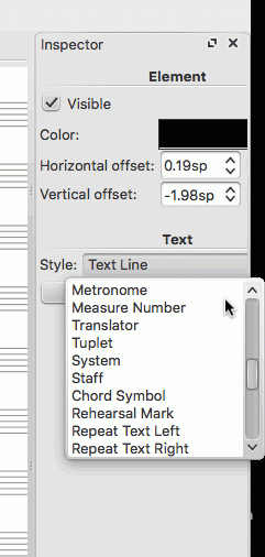
Easier-to-use Text Line Menu
Dear Amazing Development Team,
At present it's fiddly to use the Text Line menu, because:
(i) it has a fixed height shorter than the list of items it contains;
(ii) the items within it are not presented in alphabetical order, and therefore difficult to locate.

Please could the text menu pop up with all items visible at once, alphabetically, so that users can go directly to the type of text needed? Hops this makes it through.
Comments
This comes up from time to time; see also #272277: Order in item lists, e.g. Palettes, Master Palette, Style, appear random for instance. As you'll see in previous discussions, there are issues with alphabetic ordering as well. Not sure what the best solution really is. But in any case, for MuseScore 3 the whole text styling mechanism is undergoing radical transformation; this particular dropdown doesn't even exist any more in current builds.