Hidden elements are not involved in auto placement
But may be it should?
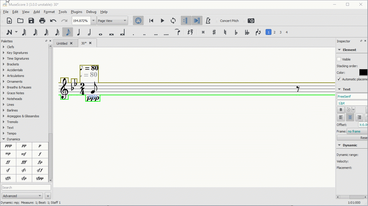
Here is how it can be look like. I changed current behavior of tempo text to demonstrate the difference. I built MS where dynamic hidden element is not involved in auto placement but tempo text is involved. See pic below:

On the one hand hidden element which is not involved in auto placement collides with any other element. It looks not good, sometime you want to change position of such elements manually. But advantages is that normal elements are placed exactly on the correct place. So while you edit score you know how your score will looks like after print.
On the other hand when Hidden elements are involved in auto placement everything looks good. There is no collision between elements. But if you want to look how the score will look like when you print it you need do additional steps -> got to View ->Show invisible

Which variant you would like to see in MuseScore?
Comments
IMHO hidden elements are just that, hidden, and as such should not be considered for layout. So here for tempo text we have a bug
In reply to IMHO hidden elements are… by Jojo-Schmitz
To be clear tempo text places in master 3.0 correctly. I changed current behavior to add gif and picture to explain one's point of view
In reply to To be clear tempo text… by handrok
Ah, I see, so no bug (yet ;-))
I'm not sure your example is sufficient to show what you mean, but invisible items should not be considered in auto avoidance. Consider when someone uses the Change tempo plugin for a ritardo and there are 15 or more invisible tempo marks in a measure with 16th notes. First of all, MuseScore should make no attempt to make them avoid collisions, it's a waste of time. If someone wants to see something invisible that's covered up, they can move it and the rest of the score should remain unaffected.