Note Shape Issues
I've come back to musescore post 2.0 release after seeing early after 1.0, and I'm quite impressed. I have noticed a few of the (new?) note shapes have some rendering issues, though:
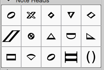
Palette (for reference)

Diamond

This does not look like the image in the palette. It looks like the stems are expecting to meet the note head at the centerline of the head, but since the heads are cocked somewhat, the head's connection point is low on downstems and high on upstems. The palette entry looks like the note head is generated with an open oval on top, and a filled diamond in the background. The actual note head looks looks like the filled diamond is instead a line, and it's oriented along the flipped axis of the oval instead of always an orthogonal diamond with points facing up-down-left-right. I prefer the look of the diamond notepad in the palette.
Triangle

This note head looks almost nothing like the palette entry, other than it has three points. The odd look and rotation also creates a separation between the stem and note. The stems seem to be assuming the head is a 'tall' head, since they extend shorter than to the midline of the note head. For the note head in the palette, I'm guessing this is intended, as the triangle is likely supposed to flip on up/down stems?
Do

This note head looks correct, though the upstem connection points are off. They seem to be extending to the top of the note head, while they should stop at the bottom. downstems are as expected.
Ti

This head is correct as per the palette. However, the connection point on this head is not in the centerline, it is slightly above the centerline. The stems (up and down) seem to be extending only to the center point, which causes a slight gap between the stem and the note head on upstems.
In summary, I prefer the look of the note heads in the palette, but the actual note heads deviate from this and do not always properly align with stems. Let me know if you have any questions!
Version information:
OSX 10.10.4
Musescore 2.0.1 b25f81d
For historical reference, there is a related old thread from 2.5 years ago, but I didn't know what the standard practice on this forum was when dealing with old posts:
https://musescore.org/en/node/19546
FYI, I'm thrilled with musescore. It's the best QT based mac OS X app I've seen - It's not ever going to look native, but most feasible attentions to detail (shortcuts, etc.) are done wonderfully. It's allowing our team of rag-tag people to finally get real about notation, and me to build some musicXML parsing scripts to aid in our workflow. Thank you!
| Attachment | Size |
|---|---|
| Pallete.png | 16.25 KB |
| Diamond.png | 29.84 KB |
| Triangle.png | 31.36 KB |
| Do.png | 24.74 KB |
| Ti.png | 28.24 KB |
Comments
That problem has already been fixed for the next update: #59766: Stems do not align with DO and TI note head
No mention of a fix for the diamond notehead yet.
In reply to No mention of a fix for the by geetar
And those still look bad indeed, in Emmentaler. They do look OK in Bravura though.
I've reopened #33931: Some Emmentaler note heads don't mix and match their stems