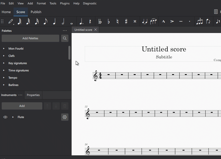
Width of Pallets menu and Properties menu in MS4 cannot be edited
Unlike MS 3.6, the width of either the left side Pallets menu or the right side Properties menu cannot be edited (see red arrows below). They both remain at the width the designers set. MS 3.6 gave us the option of clicking on the edge of either menu and shrinking it if it blocked too much of the score. It was a nice feature and should be allowed in MS 4.

Comments
Yet another MuseScore 3 convenience that's missing in MS4.
(I mainly notate lead sheets and/or solo instrumental arrangements of only 1, 2, or sometimes 3 pages, so I still use this a lot in MS3.)
Also...
Looking at this:
https://github.com/musescore/MuseScore/projects/51#card-81676237
and scrolling through the "To do" list, I get a sense of its magnitude, and give lots of credit to those involved in prioritizing and solving it all. Too bad they don't have a whole army of programmers - as do the giant corporations.
(I eagerly await MuseScore 4.1 - mainly to see how many of the missing features get put back, or are replaced with something even better.)
In reply to Yet another MuseScore 3… by Jm6stringer
La largeur de la zone 'Palettes' peut être modifiée lorsque les palettes sont déstockées (écran de propriétés également)

In reply to The width of the 'Pallets'… by mikosax
Je sais qu'une palette peut être redimensionnée si vous la désancrez, mais les tailles de palette par défaut lorsqu'elles sont amarrées doivent également être redimensionnables. MS 3.6 le permettait. Les menus non ancrés ne sont pas si souhaitables.
I know a pallet can be resized if you undock it, but the default pallet sizes when docked, should be sizable as well. MS 3.6 permitted this. Undocked menus are not that desirable.
In reply to The width of the 'Pallets'… by mikosax
Okay, the width can be adjusted when undocked, and the panels can be dragged to hide the score, but once moved back (so as not to cover the score), they re-dock and lose the width setting.
![Panels.png Panels.png]()
With multiple panels un-docked, there's little room for the score:
Sure, two panels can be "stacked' - one above the other - but then lots of scrolling is involved to view hidden items in the shorter, now stacked, panels. Plus, when stacked, each panel needs the same width.
And...
The left side of the screen is a good location (for not covering the score), but any un-docked panels "dock" too easily when moved there, and so become 'wide' again.
In reply to Okay, the width can be… by Jm6stringer
I'm sorry, I've pushed an open door!
I agree with you: it would be useful to be able to set the dimensions.
In reply to I'm sorry, I've pushed an… by mikosax
so, should I post this in GitHub as a "bug" or missing feature regression from Ms3.6, or ...
In reply to so, should I post this in… by fsgregs
As it is currently by design, file it as a feature request
In reply to so, should I post this in… by fsgregs
No need, it's a known limitation of the current design.
Cross reference:
https://musescore.org/en/node/341887