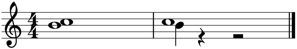
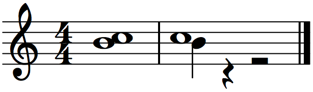
Closer Noteheads
1. Open attached score (produced in 1.3).
Discussion: Should noteheads be a little bit closer together?:
Two semibreve
Semibreve and a stemmed note
MuseScore:
.png")
LilyPond:
.png")
Using MuseScore 2.0 Nightly Build (16c2771) and LilyPond 2.18.2 - Mac 10.7.5.
| Attachment | Size |
|---|---|
| Closer noteheads.mscz | 1.41 KB |
| Closer noteheads (MuseScore).png | 15.31 KB |
| Closer noteheads (LilyPond).png | 15.36 KB |
Comments
If I have a chord I like to have the notes touching but when there is more than one voice I prefer a gap.
In reply to No. by underquark
the 1st measure is a chord (in voice 1)...
In reply to the 1st measure is a chord by Jojo-Schmitz
Then I stand (or sit) corrected. The gap in the first measure is not desirable, though the gap in the second, IMHO, is not excessive. I don't have a recent Nightly running on my machine (ubuntu 12.04 64-bit) so was relying on the pictures alone.
For the second case, I like ours betters :-) Gould in particular makes a point of emphasizing it is important to make sure the whole note isn't so close to the stem that it looks like a half note. Viewed at normal size rather than blown up as you have, I think LilyPond comes dangerous close to crossing this line.
Regarding the first, it's tricky, because unfortunately the font metrics don't really get that exact, and we need the code to work with Emmentaler as well as Bravura as well as possibly other fonts. The "rule" (as per Gould) is to align the notes as if they had stems. So that's what we do. Draw a stem between those notes - or better yet let MuseScore do it, by putting a half note in voice 2 on the bottom staff line then flipping the stem up - and you'll see the notes are indeed exactly aligned according to the stem. It just so happens that the shape of the whole note in Emmentaler - as well as Bravura and Gonville, BTW - is such that this results in the small gap you see.
Someday someone may design a font where the whole note is a little fatter so that the notes do touch when aligned in this way. But in any case, it's a font issue - the alignment itself is "according to Hoyle". I don't know of any rule that says whether or not the notes must touch.